Branding and brand identity in BilbaoBranding e identidad de marca en Bilbao
We build the brand as a system, not an isolated logo: mark, typography, colour and usage defined to scale from a favicon to a shopfront without losing character.Construimos la marca como un sistema, no como un logotipo aislado: símbolo, tipografía, color y usos definidos para escalar de un favicon a una fachada sin perder carácter.

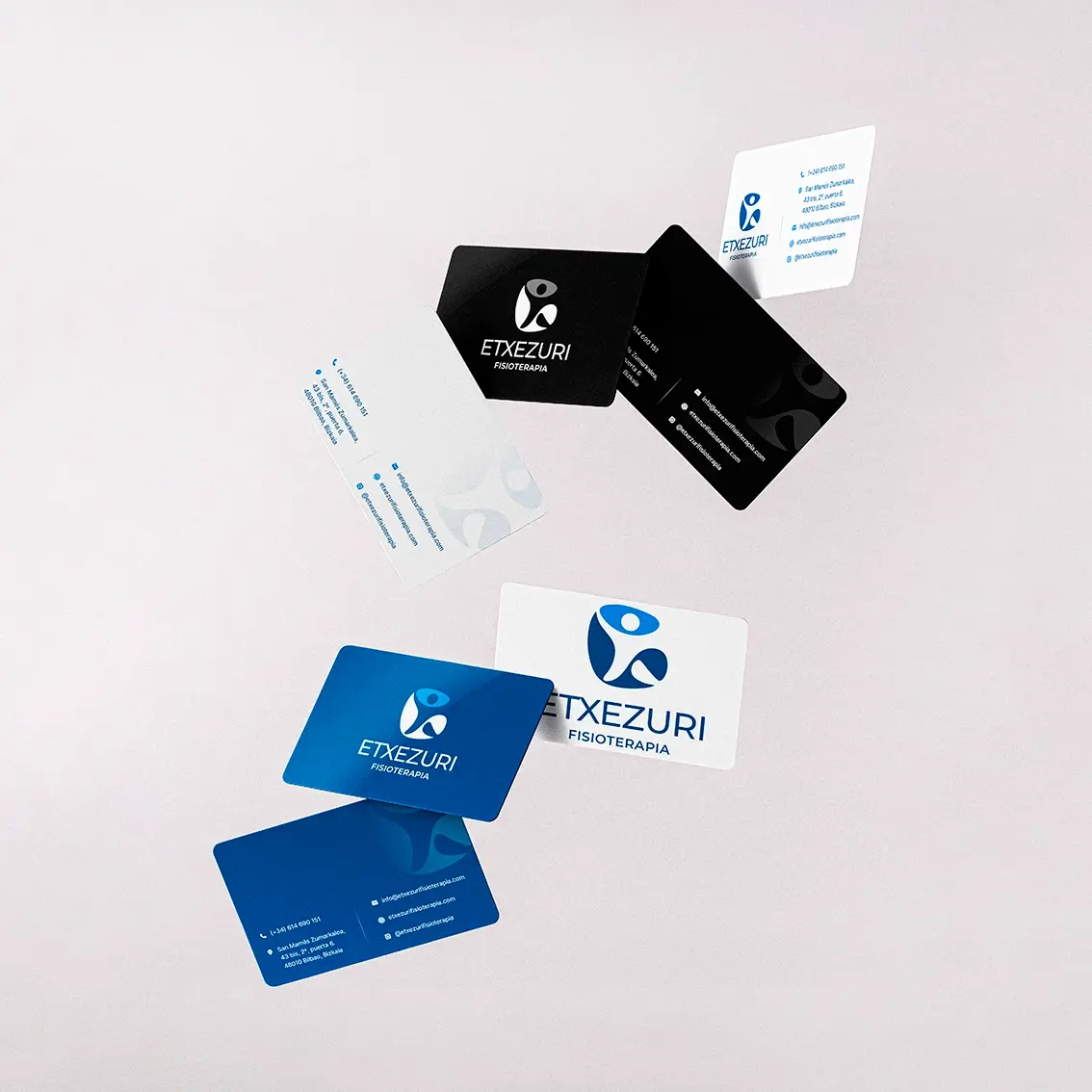
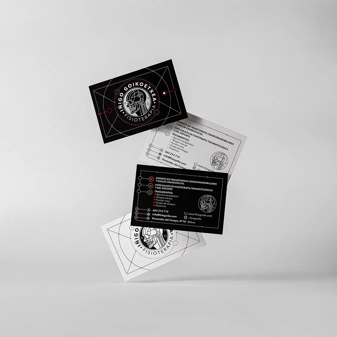

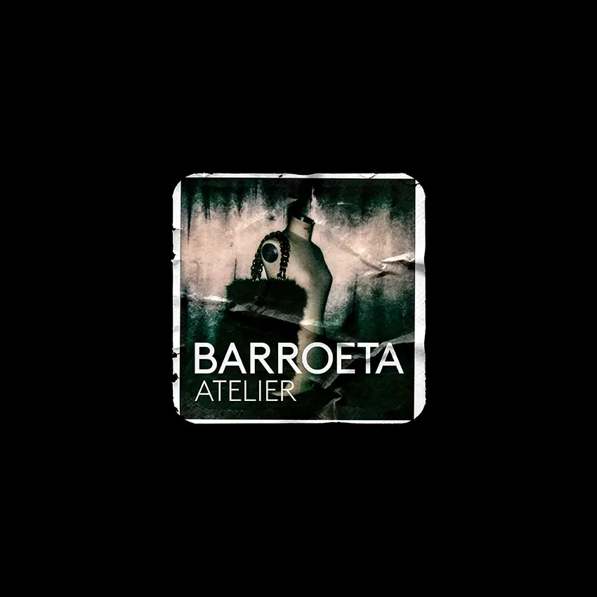
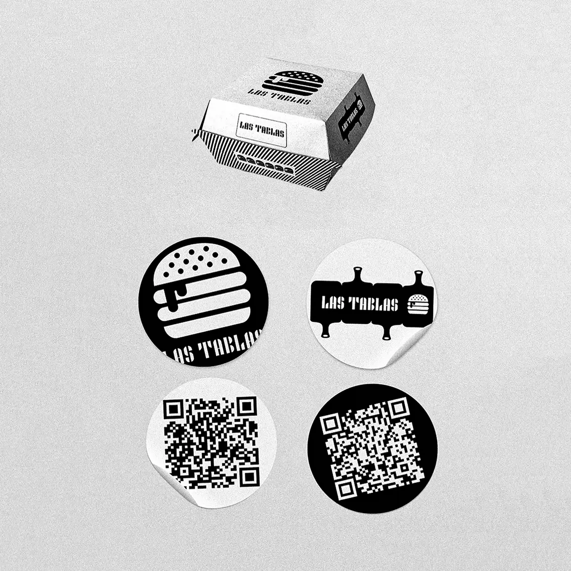
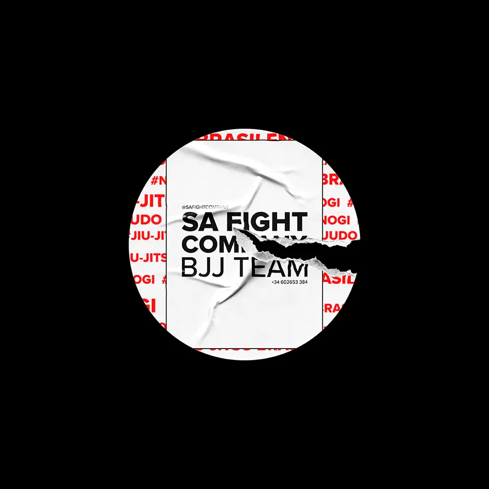
A logo is validated in monochrome and at any scale: clean vector construction, optical weights that hold up to engraving or reduction and a negative as solid as the primary version. From there we define versions, clear space, typography and palette, and fix every use in guidelines so the identity applies seamlessly.Un logotipo se valida en monocromo y a cualquier escala: construcción vectorial limpia, grosores ópticos que aguantan el grabado o la reducción y un negativo tan firme como la versión principal. A partir de ahí definimos versiones, espacios de respeto, tipografía y paleta, y fijamos cada uso en un manual para que la identidad se aplique sin fisuras.
Consistency is the technical challenge when a brand lives on screen and on paper at once. One system of typography, white space, colour and grid must carry the website, stationery, packaging and signage under the same rules. Defining them from the start avoids inconsistencies and lets the brand roll out to new media without redesigning.La coherencia es el reto técnico cuando la marca vive a la vez en pantalla y en papel. Un mismo sistema de tipografía, blancos, color y retícula debe sostener la web, la papelería, el packaging y la rotulación con las mismas reglas. Definirlas desde el origen evita inconsistencias y permite desplegar la marca en soportes nuevos sin rediseñar.
- LogoLogotipo vector construction and positive/negative versionsconstrucción vectorial y versiones positivo/negativo
- SystemSistema typography, colour, grid and iconographytipografía, color, retícula e iconografía
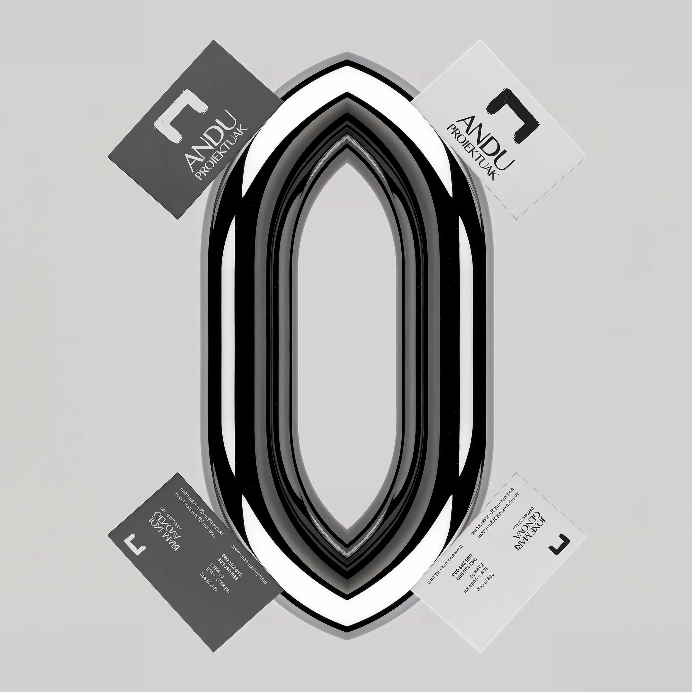
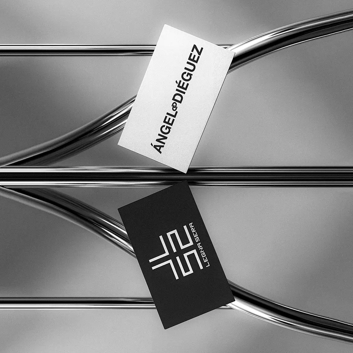
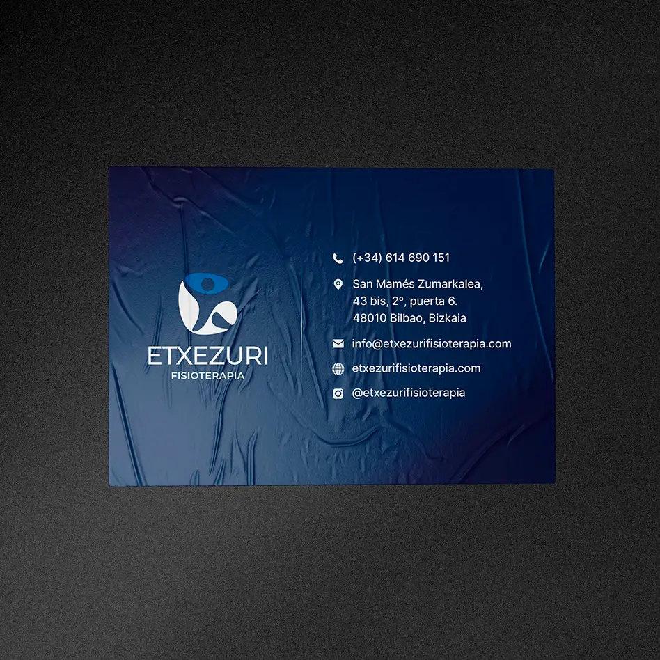
- StationeryPapelería cards, envelopes and documentstarjetas, sobres y documentos
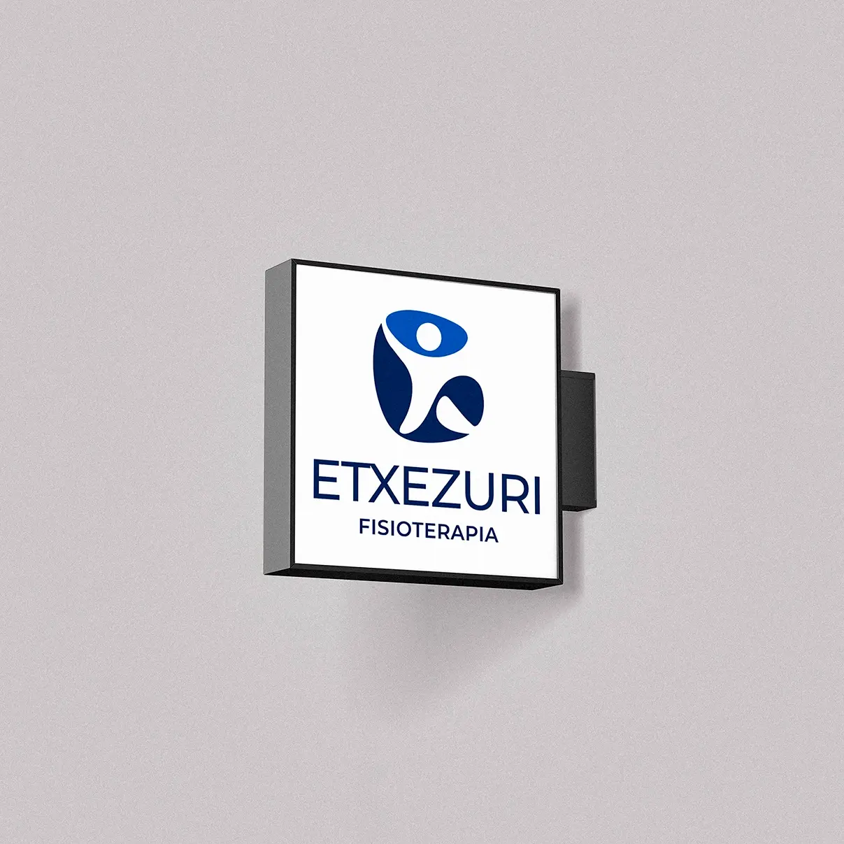
- SignageRotulación signs, wayfinding and facade applicationrótulos, señalética y aplicación en fachada
- GuidelinesManual usage rules to scale without losing coherencenormas de uso para escalar sin perder coherencia